This week I carried out my photoshoot and edited my final campaign images.
I carried out my photoshoot at the start of the week.
My photoshoot overall was a success. I gathered all the images I needed; they were all good quality and I was happy with the overall style of the images.
However, I think one thing that did not work as well within the photoshoot was the camera I used, the quality was not as high as it could have been which meant that the images I had were slightly dull due to the camera not being able to pick up the best lighting or block out the shadowing. In the future, I would ensure I prepared further in advance to ensure I had a newer better quality camera for the shoot – I would arrange to either rent one or borrow one from someone I knew.
My photoshoot preparation and chosen photos are displayed in the power point below:
Choosing my brand & Pre production
After conducting the photoshoot, I then went on to edit my chosen images.
Before editing, I learnt a variety of skills in Photoshop that I could potentially use for my photos.
Adjustment layers
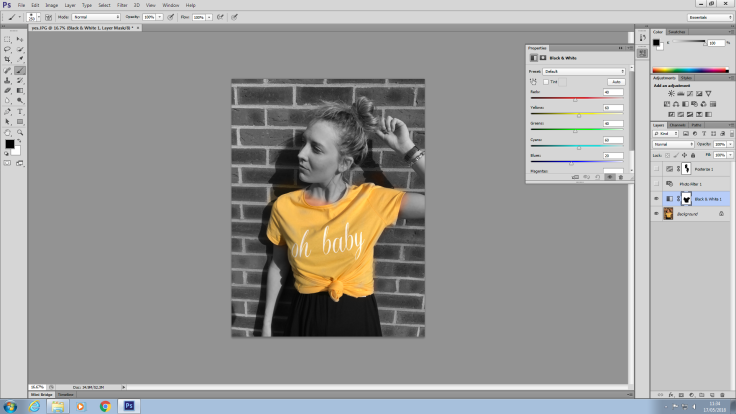
The first skill I learnt was adjustment layers.
Adjustment layers work by adding an effect to an image. You begin by selecting on the adjustment button at the bottom of the layer section. I then selected to turn the image to black and white. After selecting this effect, I then went on to select the brush tool. The brush tool works by re-adding colour to a selected section of a black and white image. As you can see above I then went on to re-colour the models top on the image.
This effect will be helpful when editing photos because it will allow me to intensify different colours within an image. Adjustment layers also help to add to the mood of a photo by making it brighter or darker.
Posterise effect
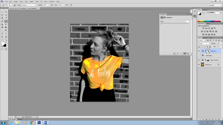
The next skill I practiced using was the posterise effect in photoshop. I used this effect to add a ‘poster’ almost pop art feel to the image. As you can see above the effect adds a pix-elated effect to the image, almost making it look fake. The background was again black and white in order to add intensity to the item of clothing.
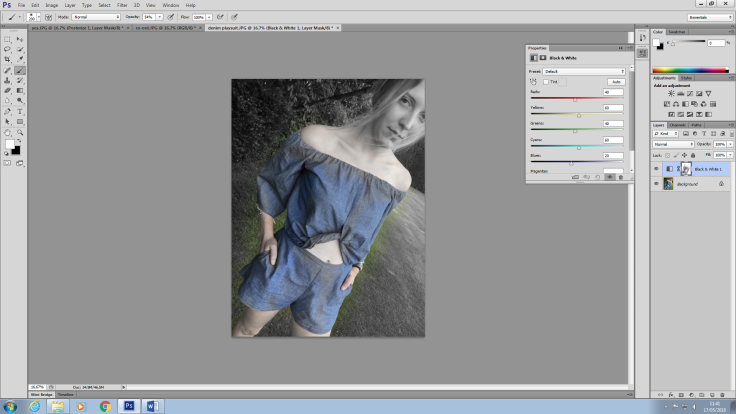
Curve effect

This effect works by allowing me to adjust the brightness and contrast of an image. You work the curve effect by right clicking the layer image and then going onto brightness and lighting. I moved up the brightness on this image aswell as pulled down the contrast to add a shadowy effect. I chose to edit my images as minimalist as possible in order to keep up the idea of my brand being fresh and new; if i were to use too many complex effects it is likely the brand would have come across as ‘fake’ and less genuine because of how unnatural my images and models would have looked.
I also increased the brightness and lighting in the image below in order to make the photo look more natural and brighter.

The full collection of my edited photos is displayed below. I decided to keep my final edited images quite natural in order to keep them in sync with my brand. The aesthetic of my brand is very ‘clean’ and natural which meant I had to keep my images quite simple and almost fresh in order for them to keep up with the values of my brand. I mainly used the brightness and contrast levels in order to edit these images however I did also use the adjustment effects of black and white with the pop of colour on a couple of photos.

May 20, 2018 at 8:02 pm
Celia Feedback: excellent post that gives an in-depth explanation of the effectiveness of using adjustment layers. Remember you can create pattern fills too that can add interesting textures to your images.
LikeLiked by 1 person