Creating colour wheels and swatches
Firstly I created a Triad colour scheme. 
I think this colour scheme could work well with my stories because it projects bright bold colours that will link well to the magical fairy tales within the booklet. The triad colours are quite vibrant and therefore show a sense of adventure.
I also created an Analogous colour scheme.
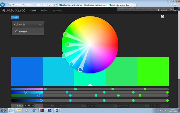
The blues and greens used within this colour scheme could be used to project a sense of nature within my booklet. Several of the stories are set in woodland areas which mean that the blues and greens fit well to the setting.
I then created a Monochromatic colour scheme.

The blues within this colour scheme could potentially be used when the fairy introduces herself in the opening pages. The colour blue portrays trust therefore this colour scheme could be a good way of persuading the audience that they can trust the fairy.
Then I created a complementary colour scheme.
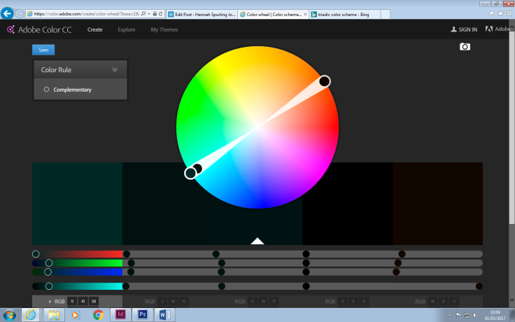
This colour scheme would not be appropriate in my booklet. The dark colours illustrate a sense of darkness which would not suit my theme at all. The dark colours would also appear to be quite boring to my audience. My audience is for young children between 5-10 and therefore the dark colours would not pop out and keep them interested whereas brighter bolder colours would appeal to my audience much more.
I then created another triadic colour scheme.
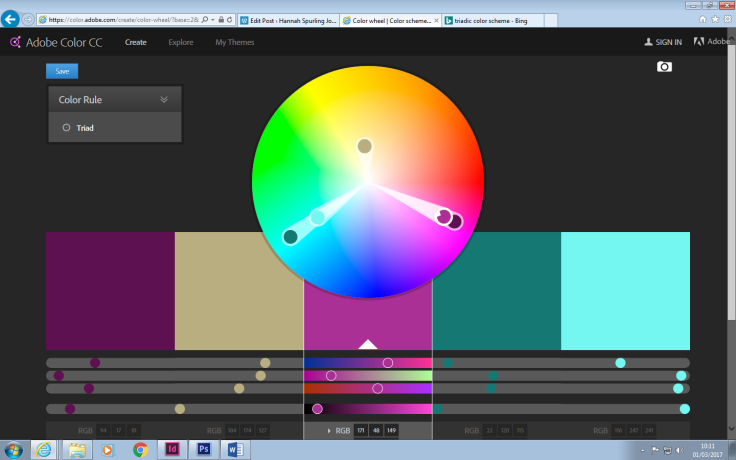
This colour scheme would work well because of the pinks, purples and blues. The vibrant colours would link well to the sense of adventure within the stories and also the magical elements. The colour purple projects creativity, mystery and magic which means that by using the colour in my booklet the magic would automatically reflect the magical atmosphere to the audience. The colour pink projects elements of playfulness and also ideas of a nice, sweet story; the tones of pink used in this palette would portray a sense of fun within the booklet. The blues again link to trust and loyalty which could work well within elements of the booklet.
I then used an image to create a palette. This image is one of the fairy’s used in my booklet. 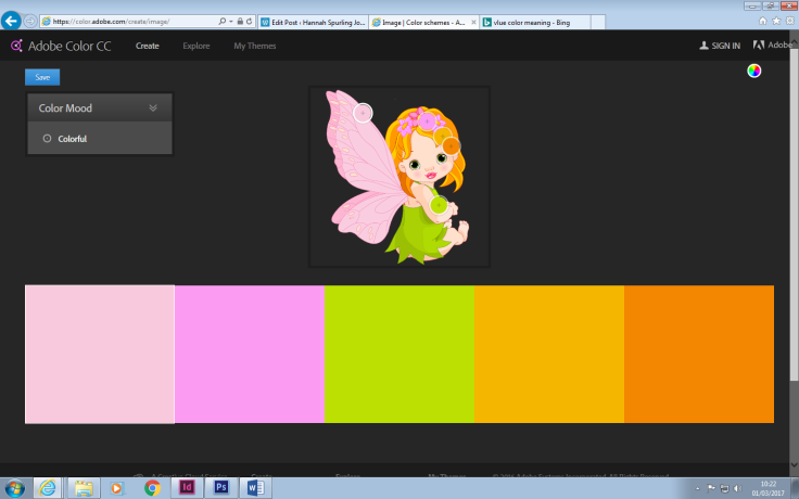
This colour swatch portrays light, bright colours that will reflect kindness, fun and adventure to my audience through the pinks, greens and oranges provided on the colour wheel.
I also created another colour wheel using a finalised image from my booklet. The image has fairy-tale characters that have been placed in a woodland scene.
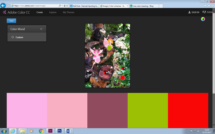
This colour wheel again includes pinks, greens and reds. These colours are vibrant and fun which will keep the young audience interested and also make the booklet more fun. The colour pink relates to a playful tone which will altogether reflect this sense onto the booklet. The booklet is meant to be a fun adventure for children and I think colour schemes such as the one provided above will reflect the elements of adventure in my story.
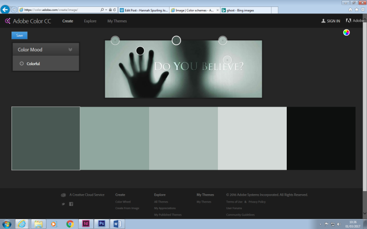
The image I used below, shows a darker colour palette. This palette would not work in my booklet. The dark tones portray death and a scary atmosphere which would not fit the atmosphere I want within my work. The image used below is taken from a horror film and therefore does not match my theme of magic and fairy tales. If I were to use this type of colour wheel within my work, I think it would confuse my audience and reflect the wrong atmosphere.
March 10, 2017 at 2:26 pm
Very effective and thorough reflection on the colour choices and use of your piece, analysing and evaluating well on the reasons why certain colours depict and serve a certain mood, feel and genre.
LikeLiked by 1 person