In this session we worked on typography and how a font can affect the way something comes across – for example we learnt that to a younger child lowercase is more fun and visually appealing than uppercase because it creates a shape! I also learnt that the shape a word creates can initially attract someone to your book because everything surrounds visuals.
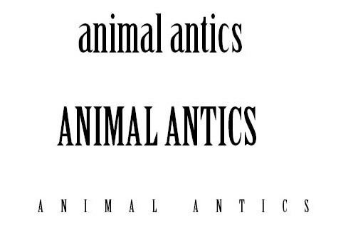
We used in design to write the name of our product and then experimented with different fonts and tracking. The lowercase defenitatly looks more appealing to a younger demographic because it creates a fun shape on the page whereas uppercase looks sophisticated and too professional for a children’s book. Bigger business like luxury hotels usually use uppercase for their logos because it attracts the audience they want. For example their logos look more like this:
![]()
Typography fully revolves around the type of person you want to attract and how you want to attract them – this session has taught me that visuals are extremely important and can either turn someone away from something or interest them.
This is the text I developed:

November 14, 2017 at 8:10 pm
Celia Feedback: you have demonstrated strong skill in typography and I look forward to seeing the end result.
I need to see much more work in progress now e.g layouts, story boards, illustrations. With only 5 weeks left you need to be very focussed and have a detailed schedule to adhere to.
LikeLike